Think of it as “What Not to Wear” for your house.
We polled local interior designers for their thoughts on the most common design mistakes and tips on how to fix them.
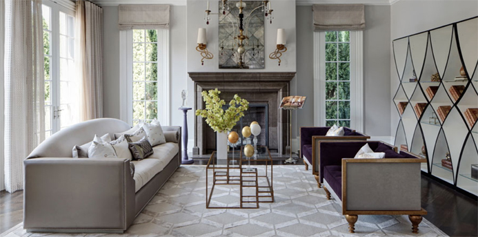
1. Out-of-whack proportions
Too many times Julia Edelmann of Buckingham Interiors & Design sees spaces where the scale and proportion of the lighting, furnishings, rugs and art are poor or predictable. Avoid grouping too much large furniture together, and add smaller pieces to soften a space. For example, don’t pair a large leather sofa with an equally large coffee table. Instead, use a pair of small tables to create a coffee table. Edelmann also likes glass, lucite or mirrored pieces for drama without heft.
On the floor, Edelmann layers a room with multiple rugs versus laying down one huge rug that can overpower and diminish furnishings. With lighting, it’s the opposite. Edelmann will opt for a larger than originally considered fixture as a way to make a bold design statement.
2. Too much “brown wood” or “matchy-matchy” furniture in the same room
Shelley Johnstone of Shelley Johnstone Design likes to mix finishes and periods in a room. In the dining room, instead of buying a matching suite, stick to two complimentary foundation pieces like the table and sideboard. Then add chairs in a different finish or period like gesso finished French chairs or black lacquer. Or, if your table and chairs match, mix it up with a painted cupboard or rattan console. It’s the juxtaposition of different finishes and styles that gives a room interest and style.
Edelmann urges clients not to rush into filling a space with furniture that all looks the same and instead take time to carefully collect and curate unique pieces and furnishings from travels, art shows and antique stores.
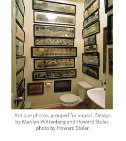
3. Over decorating a room
Less is more, reminds design consultant Peggy Schweller. People tend to over decorate their homes, filling every space with furnishings that have little sentimental value and ending up with spaces that look like a model home. She urges clients to let beautiful, personal objects command attention without meaningless distraction.
 Marilyn Wittenberg of Carol Wolk Interiors also warns against scattering collectables in a room. Instead, collections should be grouped together on one table, mantle or shelves to have the most impact.
Edelmann collects vintage hand mirrors that she hangs on the wall outside her bedroom where they add a sculptural and whimsical decorative element.
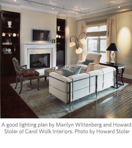
4. Bad lighting
A good lighting plan achieves both aesthetic and functional needs. For Wittenberg, too many lamps in a room says lamp store. The goal is to find a perfect balance between architectural lighting (recessed, track or cove lighting), focal point lighting (chandeliers, sconces) and lamps (task lighting).
5. Using wallpaper in every room
Again, less is more. Schweller uses wallpaper to highlight a special space, like a dining room, powder room or bedroom, and avoids using it in the adjoining rooms.
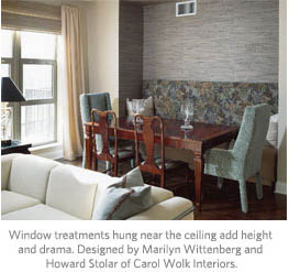 6. Poorly designed window treatments
Wittenberg reminds us that hanging window treatments at the top of the window makes a room seem smaller.
Start the rods at the ceiling to give your room height and substance. Always choose window treatments that complement your architecture and never skimp on quality.
7. Hanging art too high or scattering art
Wittenberg says common mistakes are hanging art too high or scattering smaller scaled artwork around a room rather than grouping them together for more impact.
 According to Peter Blair of Richard Norton Gallery, artwork should be hung at eye level, with the midpoint at 58 to 62 inches (and adjusted as needed if hung above furniture). For a larger scale piece, you will typically want to hang it lower. Blair also recommends balancing a large piece of art with a grouping of smaller artworks.