 If only beautiful design required using the same color and pattern everywhere.
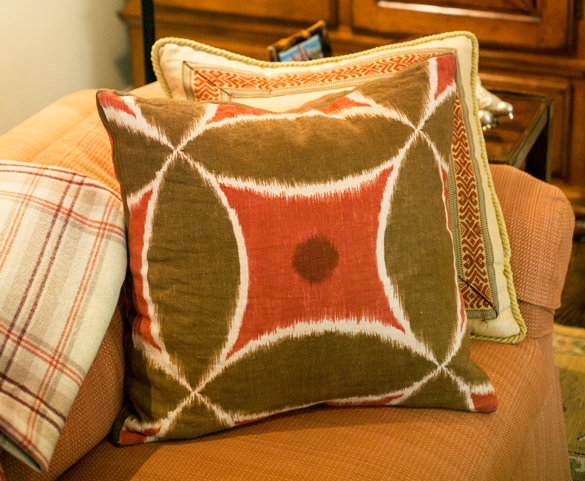
In truth, a well-choreographed room introduces visual and textural variety and often challenges our own assumptions about what “matches.”
Pulling together the textiles in a room (including drapery and upholstery fabric, carpeting and throw pillows) demands an eye for detail and a knowledge of how to blend it all just right. And while there’s nothing wrong with going it alone, remember that there’s serious wisdom to hiring a professional when it comes to interior design—particularly when a sofa alone can run upward of $2,000.
We turned to two design darlings, Susan Kroeger and Jeannie Balsam, for their expert tips on mixing it up.
There’s no magic formula
While a number of design houses offer suites of companion fabrics, their approach is typically limited and predictable. Balsam prefers to choose fabrics from multiple companies, so the combination and design aesthetic is always fresh and unique to each client.
“The truth is, if it’s beautiful to the eye, it works,” says Kroeger, who finds that most good designers never stick to a formula. It’s all about knowing how to blend color, pattern and scale.
Color
“You either see it or you don’t,” Balsam says about color. For example, not all grays are created equal; some have brown, blue or lavender undertones. The trick is to achieve a delicate balance in the hue depth, then add the occasional pop of color to bring energy to your space.
Too often amateurs will choose a print and pull multiple colors from it, then find fabrics in those colors to mix into the space. But Kroeger says that it’s not until you step back and look carefully at how the various fabrics and colors blend together—in large swatches in the actual space—that you can determine if your mix succeeds. Remember, light changes colors from space to space, so always look at your fabrics in the room you are decorating.
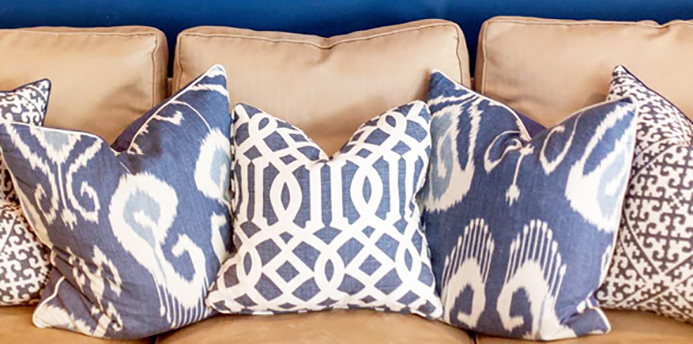
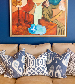
Pattern
“Give five designers the same print and it’s amazing how diverse their end product will be,” Kroeger says.
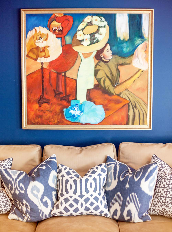
But regardless of personal style, when it comes to mixing patterns, designers find a few things to be tried and true:
- Mixing traditional and modern patterns works best when you combine classic examples of both genres.
- Similar to clothing, if your pattern reflects a classic, timeless aesthetic, it will always mix well.
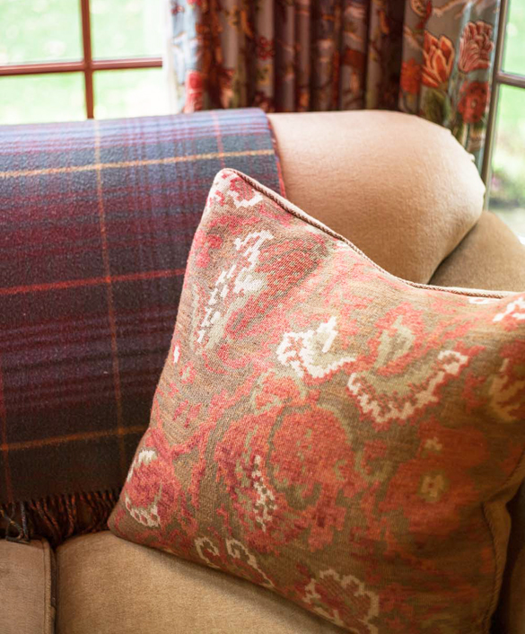
- Certain patterns are universal, no matter the design style. These include trellis and diamond patterns, plaids, stripes and florals.
- Texture is an important consideration. Mixing different textures, particularly if the color palette is limited, adds tension, interest and depth. Imagine a satin upholstered chair next to burlap drapery.
Scale
Mastering scale calls for a cohesive mix of small, medium and large prints.
“Balance plays a huge role,” Kroeger says. Never use a single size in one room. For example, you need to balance a large-scale floral with a smaller, more delicate stripe.
Scale messes with color too. For instance, a small red and blue pattern can appear purple from a distance (remember, no one’s looking at each fabric close-up, but rather as one design element paired with others in a room). Never underestimate the value of stepping back and taking a hard assessment of your selections.
And don’t forget…
For Kroeger, super-matchy textiles are the kiss of death to good design. And if any one element in your room jumps out at you, take it out.
Every project brings fantastic opportunities to reimagine color and pattern combinations, Balsam says, so challenge yourself to look beyond your old favorites. Don’t be afraid to introduce something unexpected to add interest and energy to your space, as long as it’s not a distraction.