Chicago’s top interior designers bring their fantasies to life in the 2014 Merchandise Mart DreamHome.
This year marks the 10th anniversary of the Merchandise Mart DreamHome. Judging by this year’s spaces, the neutral tones and clean, modern aesthetic that has been so predominant recently in interior design may be giving way to a more layered look characterized by interesting, bold colors and classic furnishings juxtaposed with contemporary pieces. The 2014 DreamHome will be open in its new location in suite 137 from 10 a.m. to 3 p.m. through December 7.
FOYER: JEANNIE BALSAM OF JEANNIE BALSAM LLC
When designing the foyer, Balsam recalled evening strolls in the days before Houzz, Pinterest and even HGTV. “My husband and I would walk through the neighborhoods at night and peek in to see the décor,” Balsam says. “A red foyer makes quite a statement.”
What we love: The hand-painted fabric panels from Dessin Fournir. “The design is hundreds of years old, but they are timeless,” Balsam says.
Takeaway: “Commit to color, even if it’s just in a powder room,” Balsam says. “Don’t play it safe. You might just love it.”
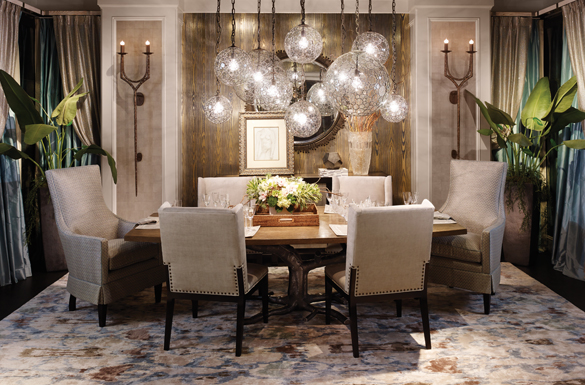
DINING ROOM: ERIK W. KOLACZ OF CONTRAST DESIGN GROUP
A trip to Napa with friends was the inspiration for Kolacz’s dining room design. “We spent pretty much the entire week sitting around a dining room table,” Kolacz says. “This room is rustic and laid back like Napa, but with glitz and sparkle that makes it metropolitan.”
What we love: The gold handmade wall covering, which was created using 14 different colors. “The gold reflection creates a beautiful ambiance that makes every skin tone look good,” Kolacz says. “The pattern has an organic feeling, but the gold metallic background gives it a downtown feeling.”
Takeaway: Don’t duplicate rooms in magazines, Kolacz advises. “You can tell if something was done with heart. Whether working alone or with a designer, express your individual style.”
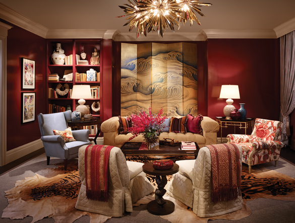
LIVING ROOM: TOM STRINGER OF TOM STRINGER DESIGN PARTNERS
For the design of the living room, Stringer envisioned how the space might look after three of his design idols met for cocktails. “I imagined that Albert Hadley and Billy Baldwin convinced Sister Parish to let them freshen up her living room,” Stringer explains. “It has Sister’s hominess, Albert’s clarity and modernism, and Billy’s way of using furniture and fabrics.”
What we love: The chandelier is actually three pieces by Tony Duquette from Remains. “This room has a planned eclecticism that keeps it young.”
Takeaway: Fix architectural issues before focusing on the décor. “We had a weird bump that we had to accommodate in the wall, so we created harmony by adding a bookcase and a built-in ledge behind the sofa that the screen sits on,” Stringer says. “Fix the problem and the decorating is easy.”
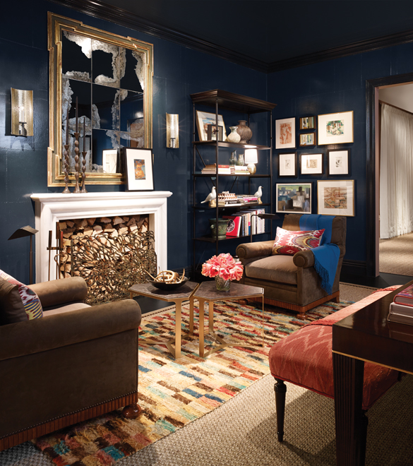
STUDY: JESSICA LAGRANGE OF JESSICA LAGRANGE INTERIORS
When designing the study, Lagrange and her team imagined a devoted art collector who had traveled the world. “He loves fine design and is stimulated by different cultures, nature, art and architecture,” Lagrange explains. “It’s a layered space with a lot of depth. We all wanted to be married to him.”
What we love: The walls are covered with a traditional chinoiserie paper lacquered Hague Blue from Farrow and Ball.
Takeaway: “A home should refl ect the person that lives there,” Lagrange says. “As designers, we collect things, so our homes look like this: a combination of different styles, feelings, textures and materials. Showcase your personal belongings, whatever they may be.”
BEDROOM: KARA MANN OF KARA MANN DESIGN
“I wanted to do a really pretty room where the materiality really speaks,” says Mann of the bedroom, which includes hand-painted fabric panels from Eltham Palace, rope side tables, and the spectacular rock crystal chandelier that Mann designed for Jean de Merry. “This room is really about subtlety, a little restraint, purity, luxury and seduction. I think a bedroom should always feel a little sexy.”
What we love: The bed by Gregorious Pinio. “Because we had such a tall space, I wanted something tall without being overpowering. This is designed from a 17th century Italian bed. The mattress fits very simply on top of it. It’s almost a platform bed.”
Takeaway: “Fill a room with substantial pieces that can stand on their own,” Mann says. “When you can pair those things with a simple backdrop, they speak volumes.”
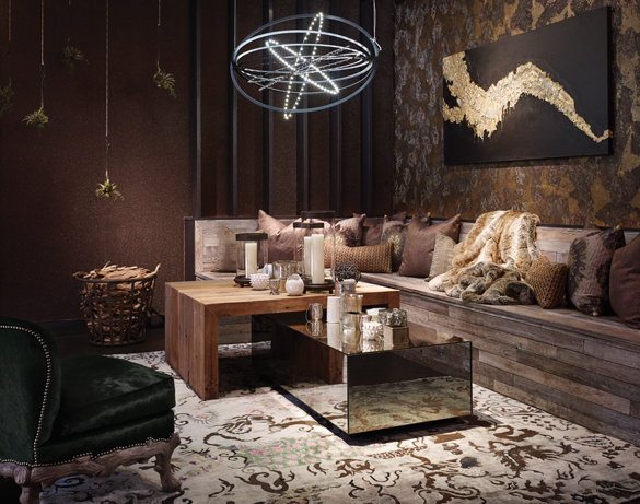
OUTDOOR: TERRI CRITTENDEN OF SUSAN FREDMAN DESIGN
For the design of the outdoor room, Crittenden imagined an urban rooftop at night. “We wanted outdoor dining to feel urban and sexy,” Crittenden says. “We used natural materials but mixed in glass and mirrors. Once you start mixing different textures in a harmonious and balanced way, their individual personalities become more alive.”
What we love: The beaded wall covering from Maya Romanoff. “The sparkly wall covering is a nod to the starry night,” Crittenden says.
Takeaway: “The language of outdoor living has evolved. It can be an extension of indoor living in a very sophisticated and casual way,” Crittenden says.
Photos by Hedrich Blessing & Dave Burk


