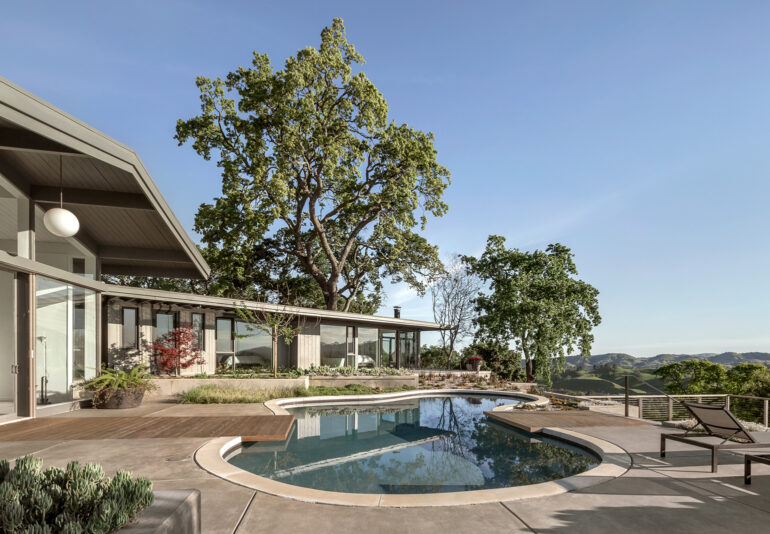
Architect Chad Dewitt uncovers the author of a forgotten 1950’s masterpiece.
BACK IN 2014, when Bay Area architect Chad DeWitt of the Oakland firm Framestudio first saw an elegant but much-abused midcentury home that his longtime clients Craig and Cara Chase had acquired in Alamo, Contra Costa, he felt a thrill.
“I had never been in the hills there,” DeWitt says, so he didn’t know what to expect — but he certainly wasn’t expecting an imposing Eichler-esque, L-shaped, three-bedroom home at the end of a long, winding oak-lined road visited by coyotes and mountain lions.
The architect was unknown.
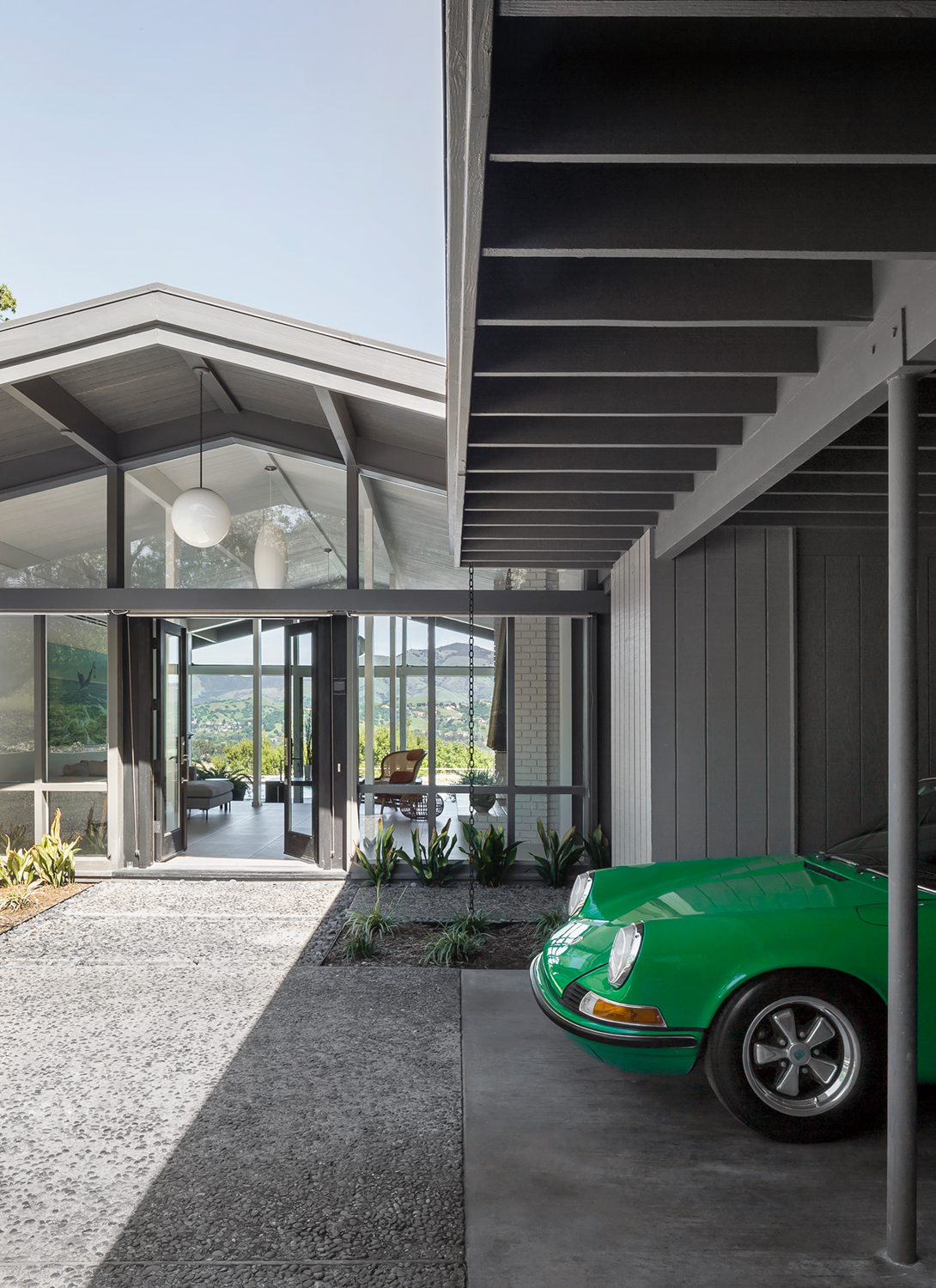 The central entry court and original carport were refreshed with paint.
“The central living room had glass on both sides and, facing east, Mount Diablo stood on axis,” he says. Even the bedroom suite in the private north wing was all glass and aimed at the view.
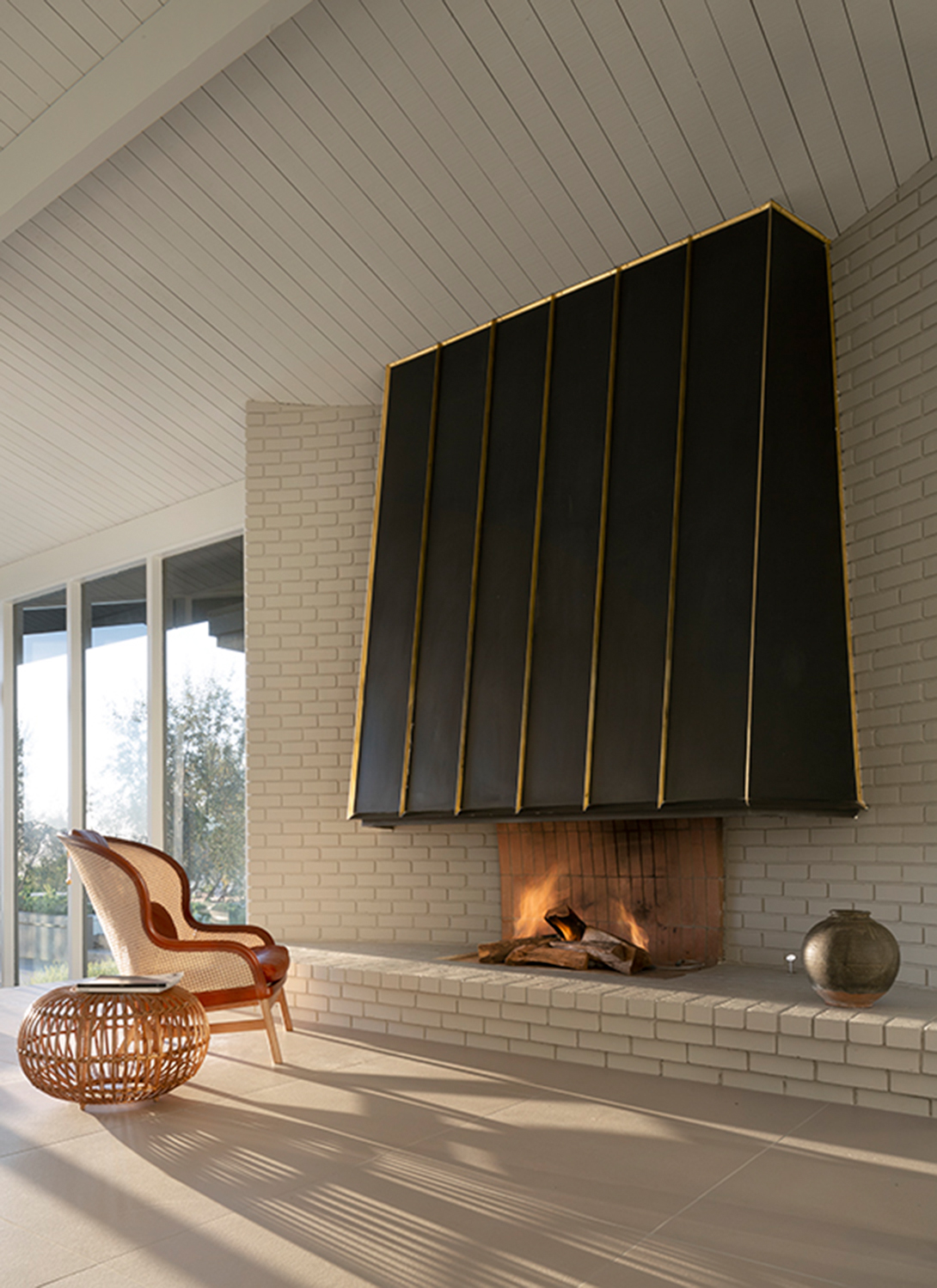
DeWitt sensed that only a master architect could have designed the single-story 4,100-square-foot peak-roofed house. How else to explain its flawless siting and soaring light-filled interiors? Not to mention its individualistic blackened brass hood above a baronial fireplace. Even its carport in the west-facing entrance court had an uncommon elegance.
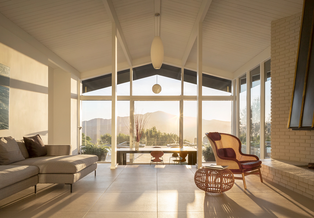 The lofty central living room with a peaked roof is built on axis with Mount Diablo in the view. Its unique brick chimney and hearth are painted white and the original brass hood created by Bay Area architect Henry Hill was saved.
But inside, it had been carelessly altered, with new commercial closets, dropped ceilings and walls pierced with cheap horizontal aluminum windows. Poorly subdivided rooms looked dark, and one awkward Jack and Jill bathroom, although original, looked out of place.
“The house had fake beams and horrible cabinets everywhere,” DeWitt recalls.
All that had to go, but he wasn’t giving up the all-glass master bathroom, which he had never before encountered in a midcentury home, nor the glowing rooms that looked out at an amoeba-shaped pool within a sheltered courtyard that reminded him of a Thomas Church garden.
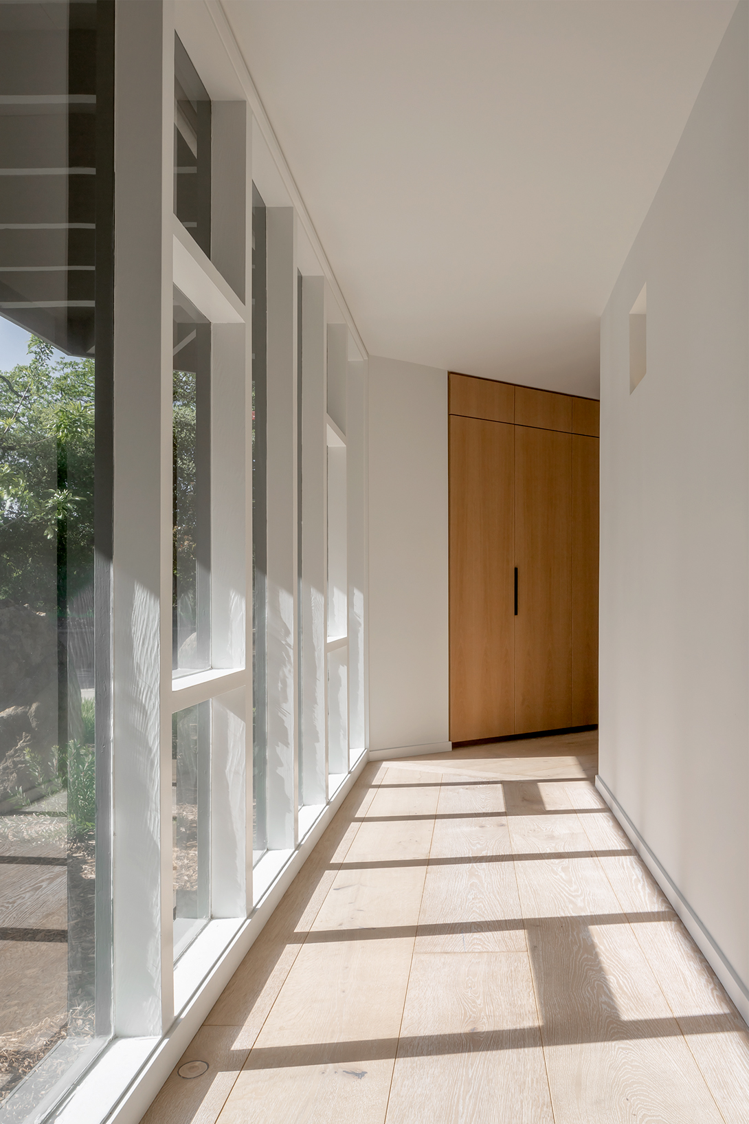 Henry Hill designed this well-lit hallway to the master bedroom.
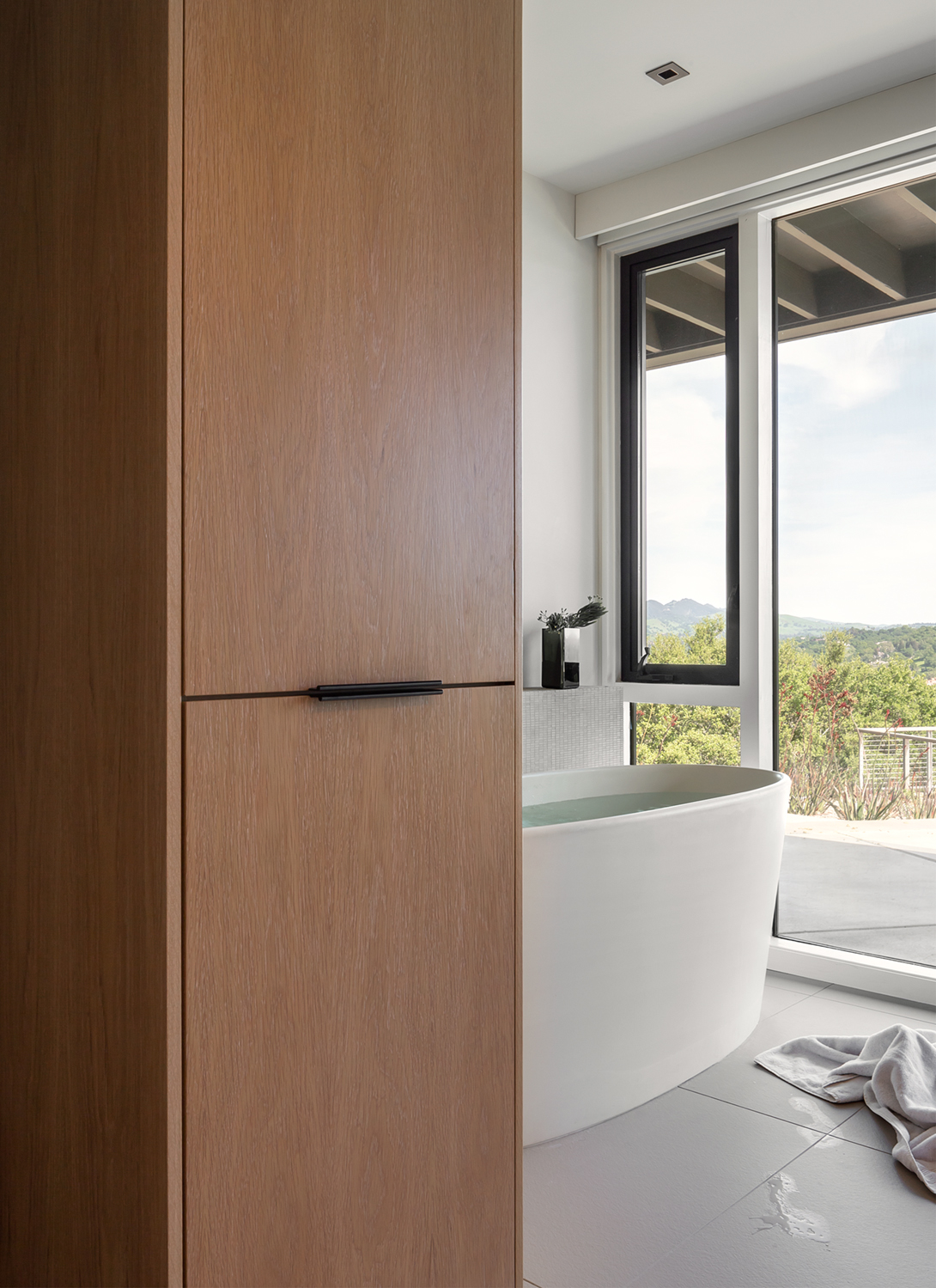 The refurbished master bath.
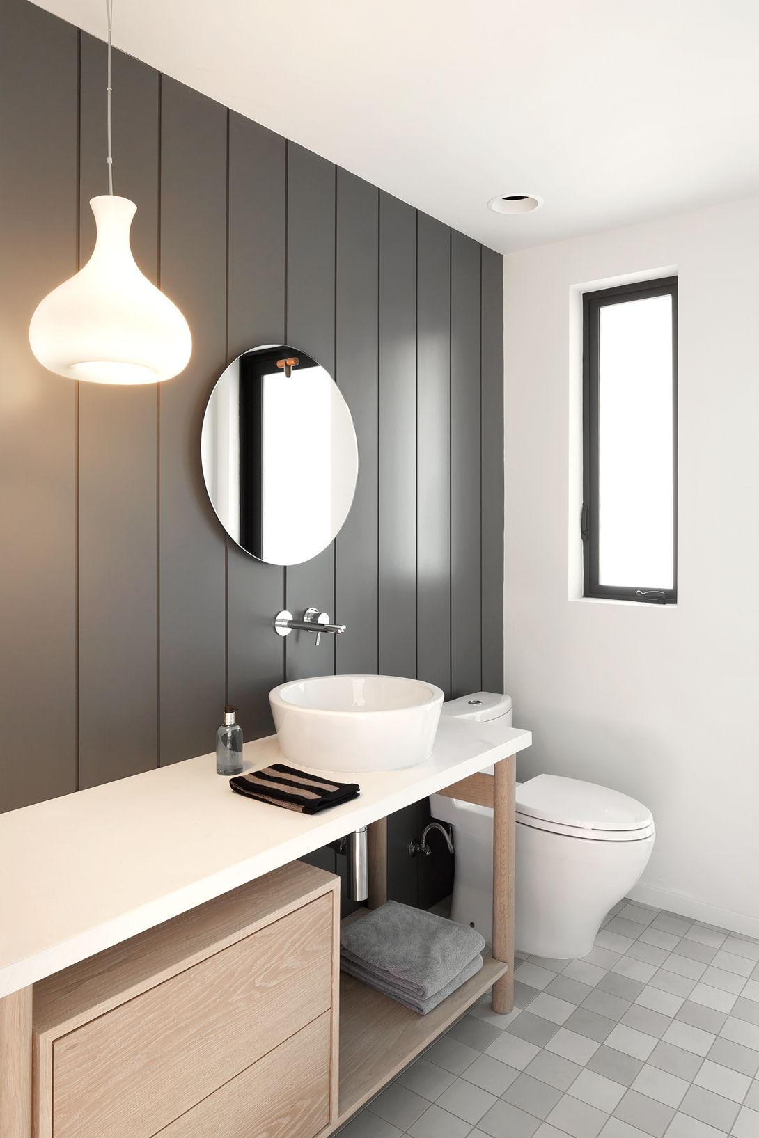 The guest bathroom has a vanity inspired by Clara Porset.
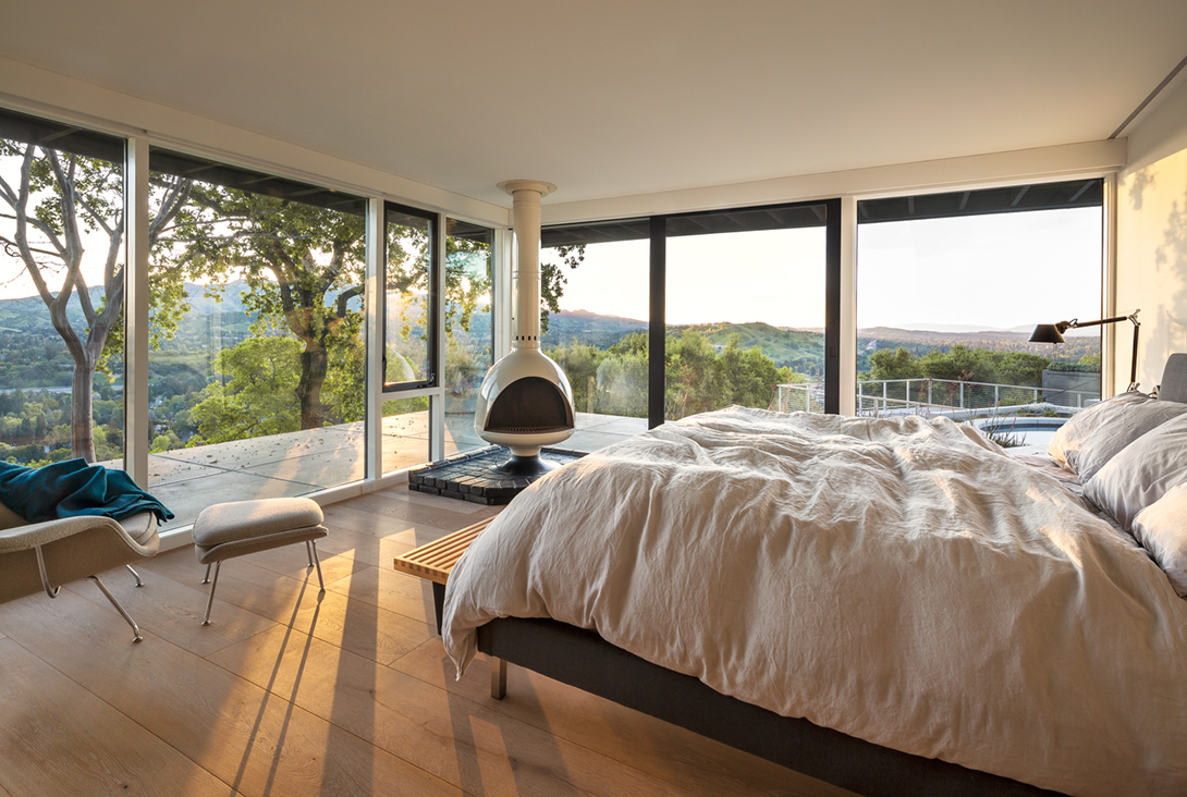 The master bedroom has its original 1950s woodstove.
As he tried to imagine what the house’s mystery architect might have done to update the building, his team quickly undid the obvious additions. DeWitt likewise did not hesitate to pull out original fitted bookshelves that were not needed and a couple of extraneous fireplaces. Steering clear of midcentury-style laminated surfaces, “we added new closets that are basically armoires set flush with the drywall and trimmed with panels of oak to echo the woods that surround the house,” he says. His team added taller floor-to-ceiling doors throughout and consolidated heating and air-conditioning ducts within a hallway. Instead of a “funny” stove in the family room that apparently once served as a maid’s room, they designed a new black brick chimney with a cantilevered hearth that looks old but is also timeless.
“We did our best to remove ‘Buckingham Palace’ moments (such as a crystal chandelier in the bedroom) and simplified the interiors to match the modern clarity of the architecture,” DeWitt says. That also meant opening up east-facing guest rooms for better connections to the outdoors and to views.
“In Europe I had found furniture by Pierre Jeanneret designed for [his cousin Le Corbusier’s utopian city of ] Chandigarh, India, and pieces by French designer Jean Prouvé, as well as modern Scandinavian pieces, and we showed our clients those designs,” DeWitt adds.
As a result, the original kitchen in the south wing, which had a partitioned breakfast area, a service porch and the maid’s room, is now one open-plan space with an island that has white oak legs inspired by Jeanneret. Elsewhere in the house, a bathroom vanity echoes a credenza designed by another Le Corbusier collaborator, Charlotte Perriand, and in a guest bathroom, a new vanity is a nod to Mexican modernist Clara Porset.
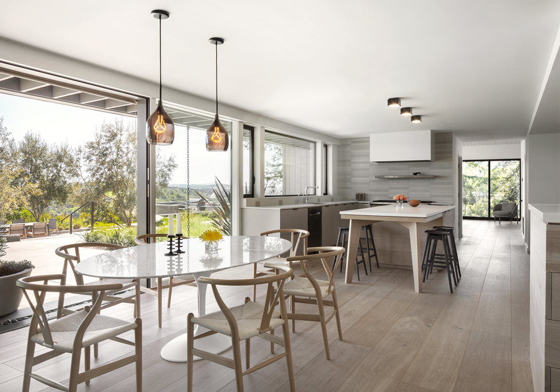 The kitchen, altered during previous remodels, was gutted to form a new open- plan space with extra storage. The legs for
a dining counter were inspired by a Pierre Jeanneret design. Beyond it is the former maid’s-room-turned–family room.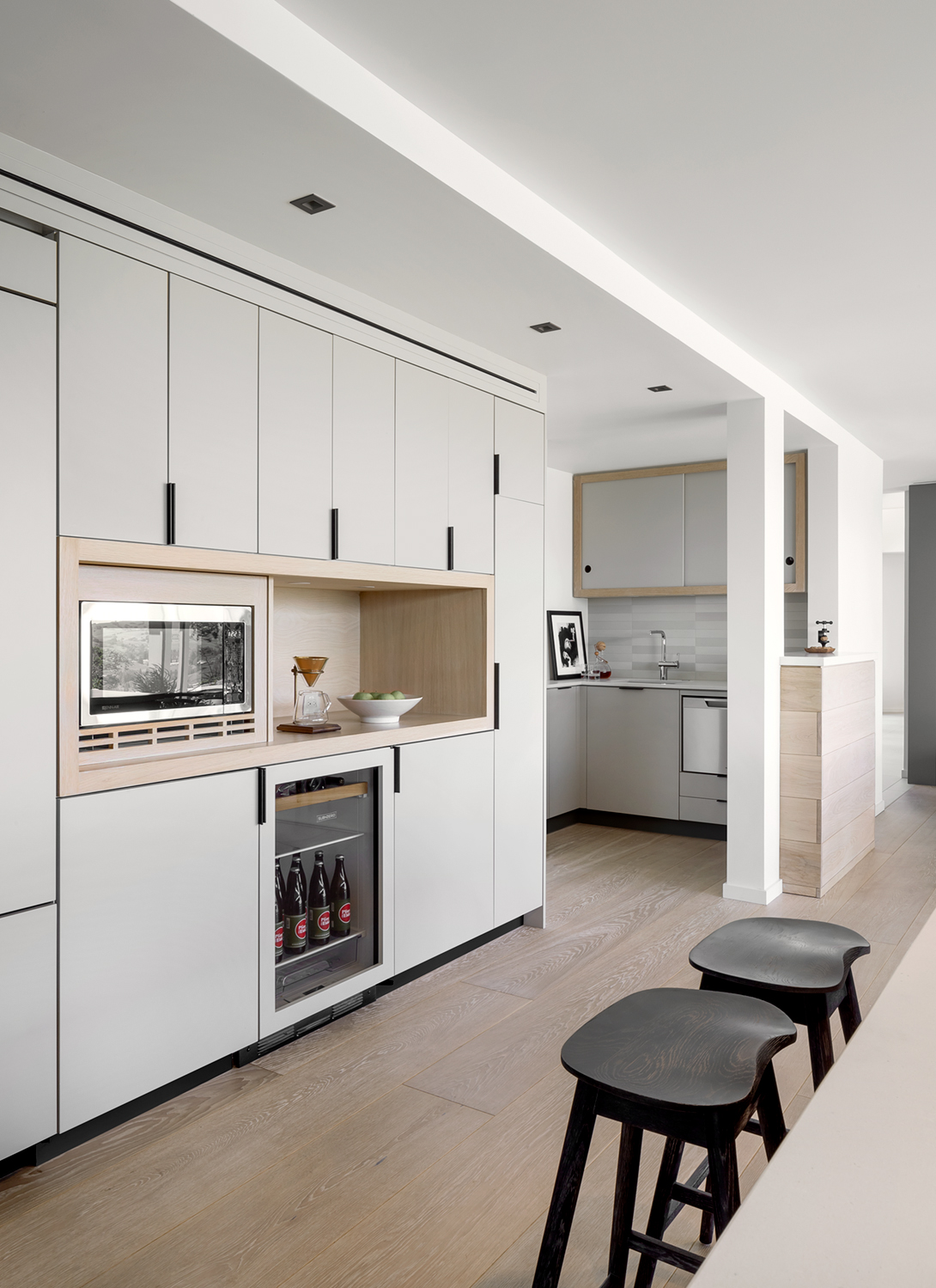 A soffit in the kitchen conceals new wiring.
In some rooms, large Italian porcelain floor tiles from Mutina have earth tones that vary subtly, pleasingly, and link the interior to new landscaping by Gary Orr that now surrounds the pool outside.
They did all this to stay true to the distinctive modern “language” of the house, but one gnawing fact remained: they still did not know who the original architect was.
Perhaps that was an advantage, because, absent information, the stylishly remodeled home is not a slavish restoration but a true development and evolution of the original.
However, DeWitt, a born-again sleuth who worked on his own Joe Esherick–designed Sea Ranch cabin with the help of Esherick’s then surviving partner George Homsey, could not let it go. He continued to look for the identity of the home’s architect, and he ultimately found original plans and renderings of the house hidden in UC Berkeley’s archives. They were by none other than a midcentury leading light of Bay Area architecture who was a student of Bauhaus founder Walter Gropius: Henry Hill.
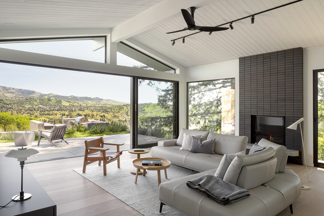 In the family room are a new black brick chimney designed by DeWitt and glass doors that open to an outdoor kitchen.
Hill had been closely aligned and partnered with midcentury greats, including architects John Dinwiddie and Erich Mendelsohn, and later continued with John Kruse to create Bay Region–style modern homes strongly influenced by Japanese design.
As DeWitt had suspected, the house was truly historic. It had been designed in 1959, for a Dr. Paul Winn, when Hill was in his heyday. In Hill’s drawings Dwight saw a round bed and a wet bar, which no longer exist, and the quintessential brass-toned living room fireplace, which luckily he had saved even though his clients wanted it gone.
“In a remodel, it is equally important to leave things alone,” DeWitt says, pointing to a freestanding wood stove he was also able to preserve in the master bedroom because it rang true.
Thanks to such details, DeWitt observes, “it is really unclear where our work started and where the original stopped.”
ORIGINAL ARCHITECT
Henry Hill & Associates, 1959
ARCHITECT & INTERIOR DESIGN
Frame Design, principal architect Chad DeWitt, project architect Alice Hwang, interior designer Cristina Baracetti;
LANDSCAPE DESIGN
CONTRACTOR
PATIO
Sloff outdoor sun lounger, Blue Dot, ;
LIVING ROOM
Ebony limed tractor stool; El Dom table, Hannes Wettstein; Finlandia tall vase, Alvar Aalto; tall cigar bubble pendant, George Nelson; three-legged ant chair, Arne Jacobsen, vintage; Dandy armchair, Pierre Sindre; Albini ottoman, Franco Albini; Hugo sectional;
FRONT ENTRANCE
Prescolite ball lights, original to house;
DINING AREA
Vessel lights, Samuel Wilkinson; Hobart candlestick; wishbone chair, Hans J. Wegner; Saarinen oval dining table, Eero Saarinen; Heath armchair, Yabu Pushelberg;
BATHROOM
Blu Dot Hang 1 mirror; light fixture, Eva Zeisel
BEDROOM
Malm Fire Drum 3; Womb chair, Eero Saarinen; platform bench, George Nelson;
FAMILY ROOM
The Spanish Chair, Boge Mogensen; Haiku fan, Big Ass Fans; Around coffee table, Thomas Bentzen; Pon table, Jasper Morrison; Ply rug, Margrethe Odgaard; Egeo sectional.
This article originally appeared on spacesmag.com.

Editor-in-chief Zahid Sardar brings an extensive range of design interests and keen knowledge of Bay Area design culture to SPACES magazine. He is a San Francisco editor, curator and author specializing in global architecture, interiors, landscape and industrial design. His work has appeared in numerous design publications as well as the San Francisco Chronicle for which he served as an influential design editor for 22 years. Sardar serves on the San Francisco Decorator Showcase design advisory board.
