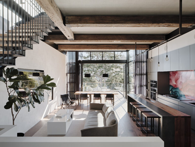
A San Francisco design duo modernized a traditional craftsman home by opening it to the outdoors.
“THERE’S A SENSE OF WANTING to bring back the elemental, the wild,” says designer Kevin Hackett, whose firm Síol Studios recently joined forces with architect Ross Levy to transform a modest bungalow on a down-sloping lot in San Francisco’s Noe Valley into a light-filled three-story home that’s woven into its valley landscape.
“I think we crave nature more than ever because we’re not connecting to it as much,” Hackett says.
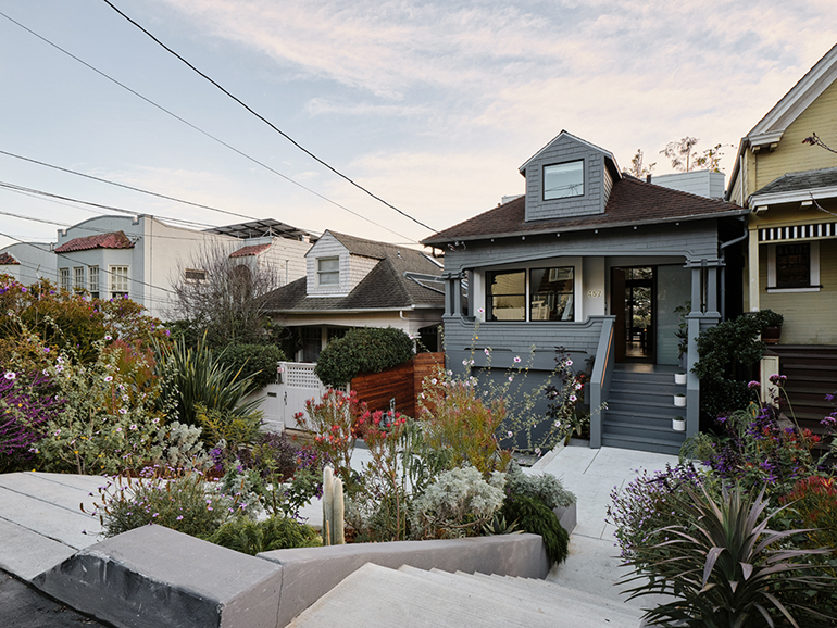
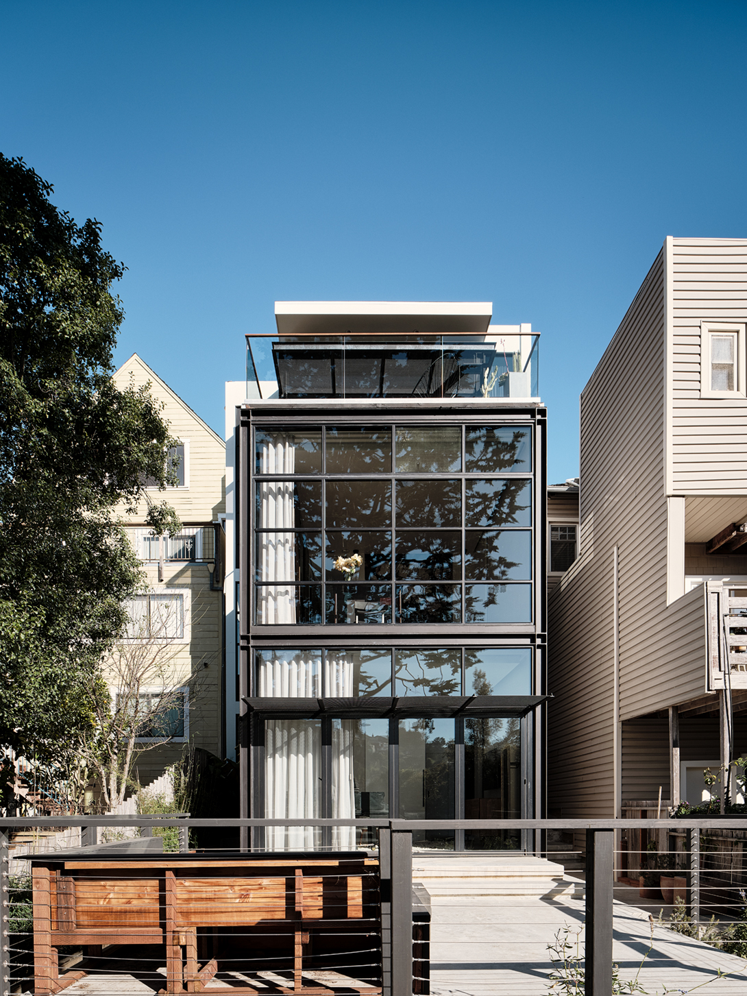
From a curb perspective, there’s no indication that Hackett and Levy’s design facilitates a connection to nature. Its gray-painted Craftsman-style facade, just like those around it, references the city’s architectural past, when punched windows, low ceilings, opaque walls and small rooms represented the idea of home. “It’s the old fabric, which city planning authorities demand we keep because they feel it maintains the general charm and character of San Francisco,” Levy says. The architect and modernist at heart did what many city architects do and created openness and airiness in the rear and the interior of the house, while leaving its traditional-style street presentation. “It’s hidden architecture,” Levy says.
The two residents, who work in technology and community arts and organization, pass through the entry and traverse a steel-grate bridge into an expansive living, dining and kitchen area on the house’s top level. Levy punctuated the open-plan space — and the entire rear facade — with glass and steel that visually explodes with the sublime greenery of the valley below. “You begin with a Craftsman aesthetic, but then step over the threshold and kind of float on that bridge and it’s almost like you’ve walked into a treehouse,” Hackett says. “The bridge lets you know you’re entering new territory and sets up the experience for the rest of the home.”

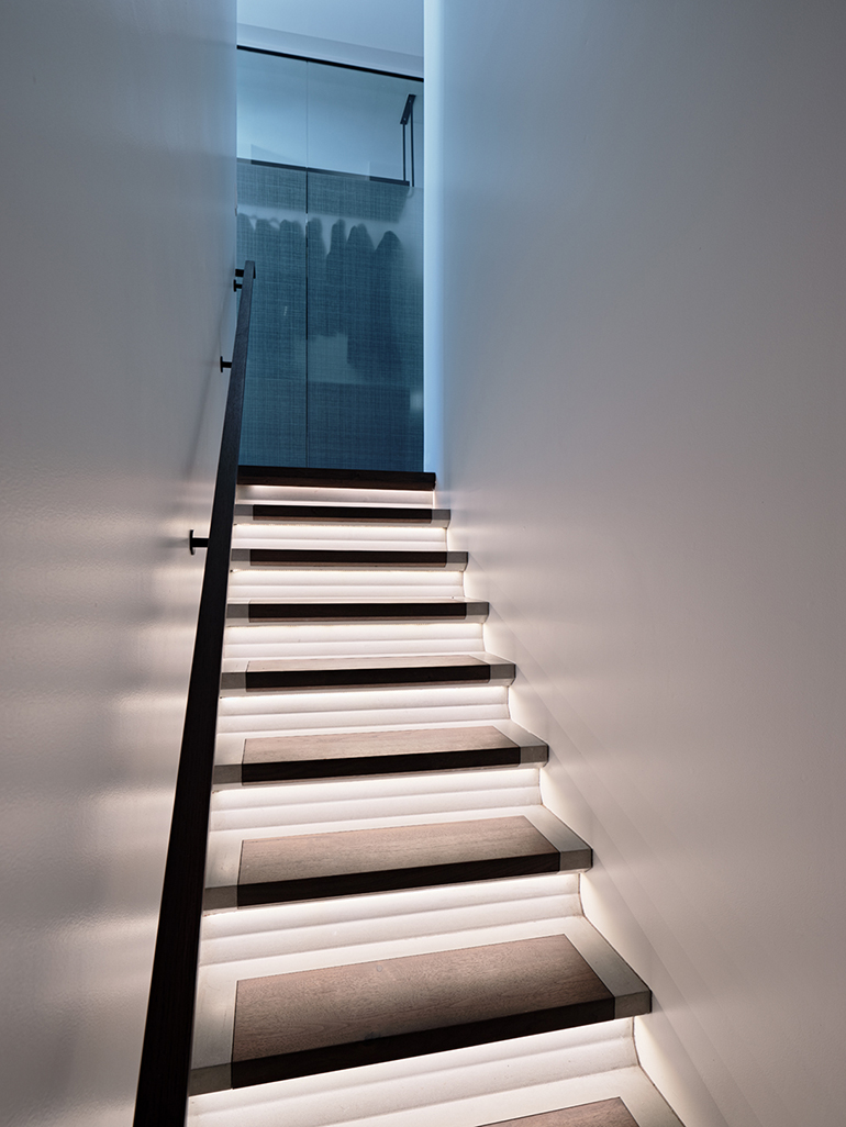
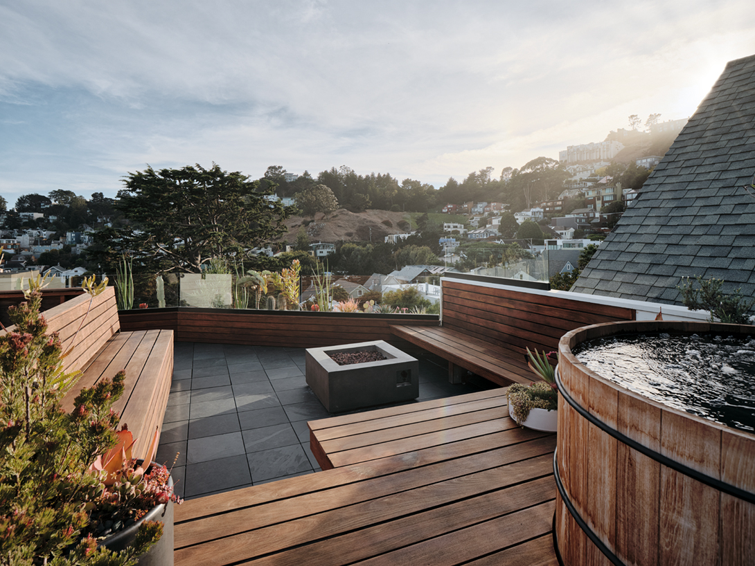
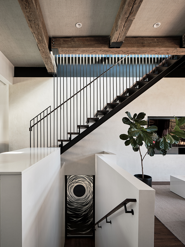
Levy also designed a suspended walnut-and-steel staircase with a slim silhouette that accentuates the airiness of the beamed living space and leads to a new rooftop deck Hackett designed. The light feel of the staircase marks your ascension to the highest point of the home, where a concrete fire pit and bluestone pavers offset built-in redwood benches and a red cedar hot tub. It’s a space above the treetops that’s abuzz with the sounds and sights of the city.
Inspired by the ways the architecture integrates with the terrain, Hackett appointed the interior with natural materials and finishes. Gauze-like sheers dress the steel-framed windows in the kitchen-dining-and-living area, mitigating the sunlight that washes over the space’s lime plaster wall.
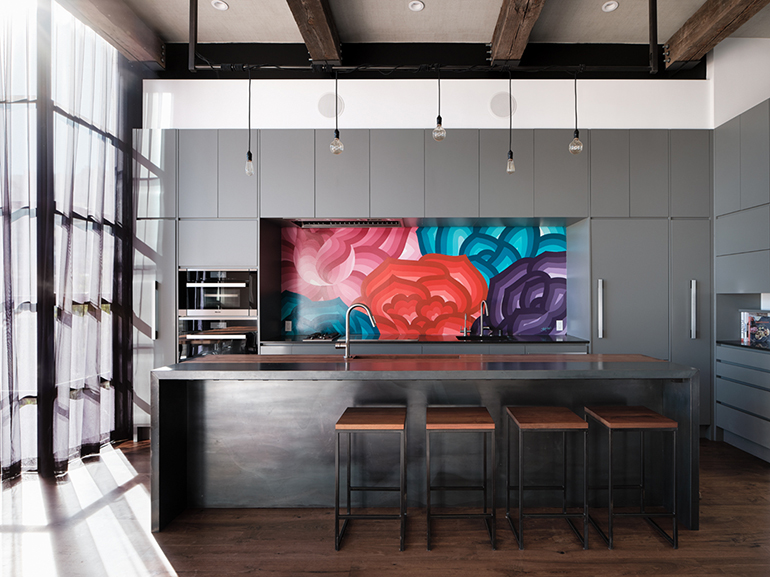
“The plaster almost sucks in that light, accentuating and reflecting it,” Hackett says. “Everything is pared down so the focus is on the poetics of the sunlight.” The designer employed walnut flooring that lends still more warmth and texture and pays homage to the tree trunks that populate the valley. The kitchen island, too, is crafted with walnut as well as blackened steel. “It’s as if the walnut comes up and out of the floor,” Hackett says. “And the steel will wear beautifully and exhibit a nice patina.” A brilliant and massive painting by Jet Martinez that depicts riotous florals marks the kitchen area, making it appear more like a gallery corner than a functional space.
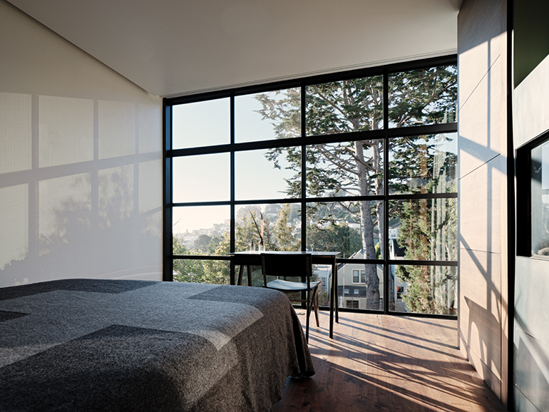
As you move to the lower floors, where Levy situated the bedrooms and bathrooms, there’s a quieter sense of being anchored. Hackett and Levy devised a shifting materiality for the staircases to enhance the sensation of moving from high to low: the airy steel-and-walnut up to the roof, walnut and walnut-and-concrete staircases from the living room down to the bedrooms; solid cast-concrete stairs to the ground level.
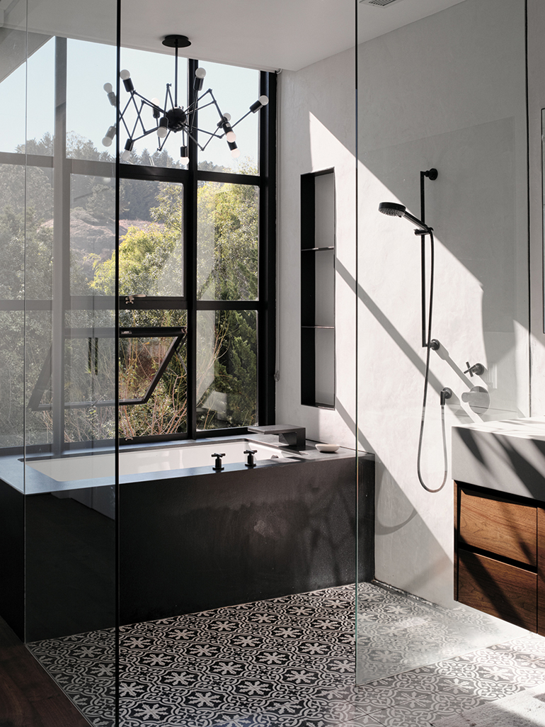
The bathroom design adds more sensory impressions. A lime plaster wall in the second-level master bath provides yet another canvas for sunlight play, and in the ground-level bath, a plant wall within a light well presses up against a partially etched glass floor-to-ceiling window, creating the feeling of being outdoors.
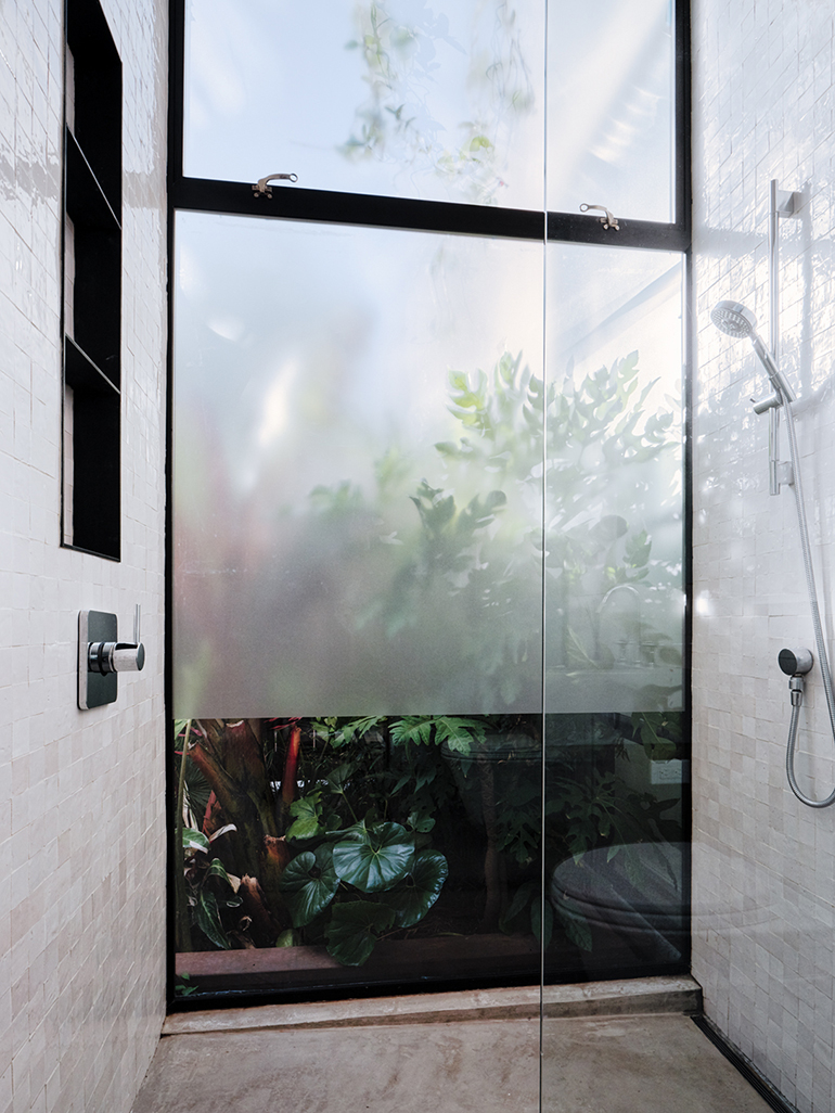
“The way you’re drenched in greenery and sunlight is remarkable,” Hackett says. Levy agrees: “It’s rare in San Francisco to be able to experience the outdoors while you shower,” the architect says.
Hackett covered the ground-level bath’s shower walls in idiosyncratically textured clay tile that harnesses glittering sunlight and bounces it around in a beautiful way. “The clay has amazing subtleties,” the designer says. “This shower is an experience that slows down mind-and-body space, offering an opportunity for true pause.”
The entire home “has a natural vibe so you almost forget you’re in San Francisco,” Levy says. “When you stare out the back of the house, you’re not looking at the downtown skyline or the Golden Gate Bridge. You’re looking at the valley and it’s this peaceful, beautiful thing.”
It’s a mood Hackett deliberately sought to cultivate, given how technology and constant scrolling impose a staccato rhythm to modern life. “Pinterest and Instagram can be a dangerous vacuum of style,” says the designer, who specifically avoids letting clients describe the way they want spaces to look and instead asks them to identify the way they want to feel and live in each area of their home. “I don’t want to talk about aesthetics,” he says. “I want to know what kind of sensory experiences they’re after.” Hackett finds that during these conversations, a desire to connect with nature emerges practically every time. “Our bodies and minds are attuned to natural systems,” he says. “Before we leap into the science behind this thing or the other, we need a firm grasp on our humanity.”
ARCHITECT
INTERIOR DESIGN
CONTRACTOR
LIVING AND DINING
Toro lounge chair, Blu Dot; Spark dining chair, Knoll; Equipo light fixture, Santa & Cole; custom walnut and steel dining table, Denali Furniture; Grace modern couch, Montauk; Atelier coffee table, Serena & Lily
KITCHEN
Jet Martinez mural; island, Trojan Woodworking; Edison bulbs, City Lights; steel and walnut stools, Ohio Design; Nathan Richard Phelps painting
PATIO
Woodland concrete fireplace; Collecting Flowers planter; red cedar hot tub, Roberts
BATHROOM
Double Octopus light fixture, Delaespada; limestone plaster walls, Orit Yanai
BEDROOM
desk, Blu Dot; chair and bedding, CB2; walnut floor, Trojan Woodworking
STAIRCASE
Fabricated by Concreteworks and Trojan Woodworking Custom design, Síol Studios
GUEST BATHROOM
This article originally appeared in Spaces’s January 2020 print edition under the headline: “Back to Nature”.
 A design, architecture and art writer and editor for nearly 15 years, Laura Mauk worked as an on-staff editor at Condé Nast’s Architectural Digest. While Mauk is currently based on the East Coast, she grew up and lived most of her life in various northern and southern California locations, inspiring a writing focus that often explores modernist and progressive aesthetics and the way the built environment interacts with nature. Mauk’s work has appeared in numerous publications, including Dwell, S.F. Chronicle, Wallpaper*, Interiors, Luxe,Silicon Valley Magazine and Paper.
