If you’ve always dreamt of owning a home in Napa, Sonoma or nearby, At Home in the Wine Country (Gibbs Smith, August 24) deserves a place on your coffee table. Authors Heather Sandy Hebert and Chase Reynolds Ewald take readers inside 17 new, swoon-worthy wine country homes by elite architects and designers — and the photography is breathtaking.
The design of the homes is deeply attuned to the environments, which range from sun-drenched vineyard valleys to forested hillsides with challenging rock formations. SPACES editor Liz Logan sat down with the authors to discuss what makes the new architecture of wine country so special.
What made you decide to write this book now?
Chase Reynolds Ewald (CRE): For a really long time, California wine country architecture looked to Europe, and in the last two decades, roughly, things have changed and evolved. Style and design has come into its own and is very much place-based, created as a reaction to the specific site and the micro-climate that it’s in. It’s been very exciting to see, and no one had covered this new California architecture comprehensively. Our book is a close look at the top talent in design architecture, construction and landscape architecture in the magical climate that is the California wine country.
Heather Sandy Hebert (HSH): The Paris Wine Tasting, known as “The Judgment of Paris,” in 1976, put California’s wine country on the map; that’s when wines from this region won against wines from France. So, wine country came onto the world stage. It was competing against Europe, so naturally, it adopted the chateau style. More recently, it was confident enough to strike out on its own.
CRE: California has led the way when it comes to indoor-outdoor living, going back to the 1950s, with the ranch homes, the kidney-shaped pools and all of the midcentury architects.
When you say the architecture is place-based, site-specific and having to do with micro-climate, is there a specific example that springs to mind?
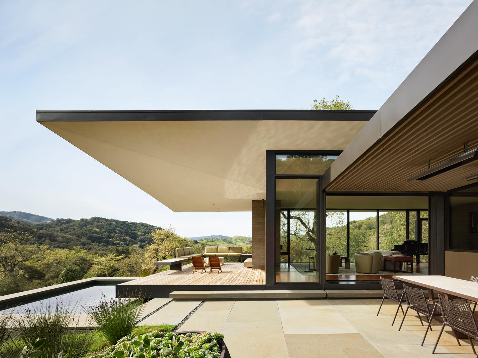
CRE: Every single well-crafted custom home in the wine country starts with place, and that includes views and buildable sites. Some are on ridges, some are down in the valley floor among the vines, but there are all these vagaries of climate: One hill has a different fog pattern than the hill next to it. So, it’s really specific with wind and sun; a slightly different orientation creates a different experience. The architects are looking carefully at all of those things when deciding on things like the overhangs, or where you put a water feature to create natural air conditioning. Some of the properties have conifers around them, and some of them are much more like what we think of as wine country, with the rolling hills and oaks.
HSH: A good example is from a project called the Winged Retreat. It’s got a roof that looks like a butterfly landed. It’s in the Santa Lucia Highlands, in the Monterey wine country. The architects were Joshua Aidlin and David Darling of the firm Aidlin Darling. They take camping gear and camp on each site for a full 24-hour or 48-hour cycle. They observe what the wind feels like, where the fog comes from, where the light comes from, the sounds and what birds you hear from different directions. That informs everything that they do.
What are the challenges that come with building in the wine country?
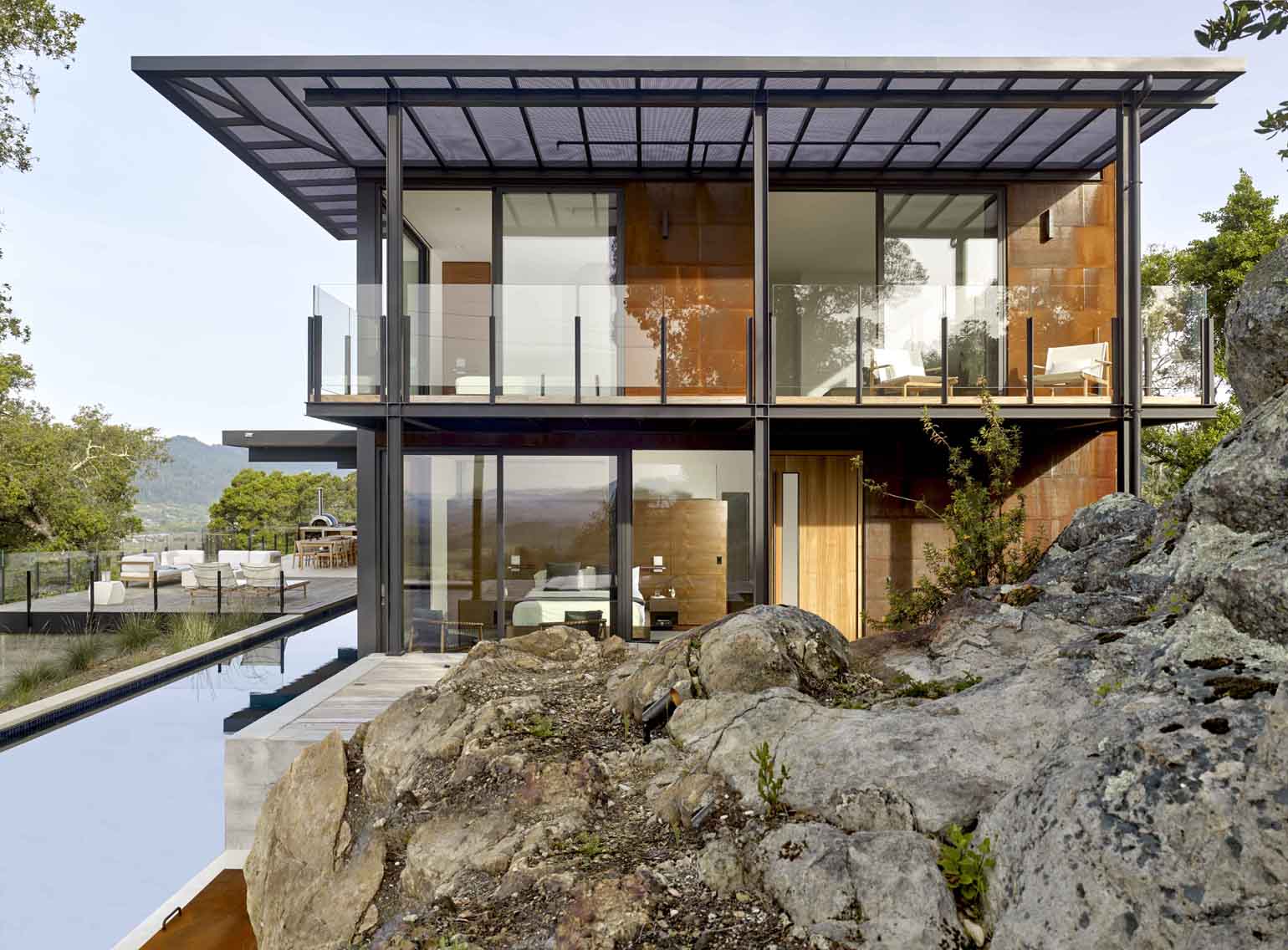
CRE: With one home by the architecture firm Zack/de Vito, the clients wanted to be right up on the edge of the ridge overlooking St. Helena, with this huge valley view across to the mountains on the other side. But they didn’t want to be “skylining” and creating light pollution for the people below, and they didn’t want to be terribly visible.
So, they had to build the house into the hillside and low profile, but there was this enormous boulder structure to consider. Not only could they not move it, they didn’t want to move it. They wanted to use it as sort-of a Zen garden-style artistic feature. So it anchors one end of the house. The little lap pool is right next to that, and the master bedroom is next to the pool. You step out of the end of the house, and you’re right at these boulders. If you step out the other side of the same room, there’s the pool and the view beyond.
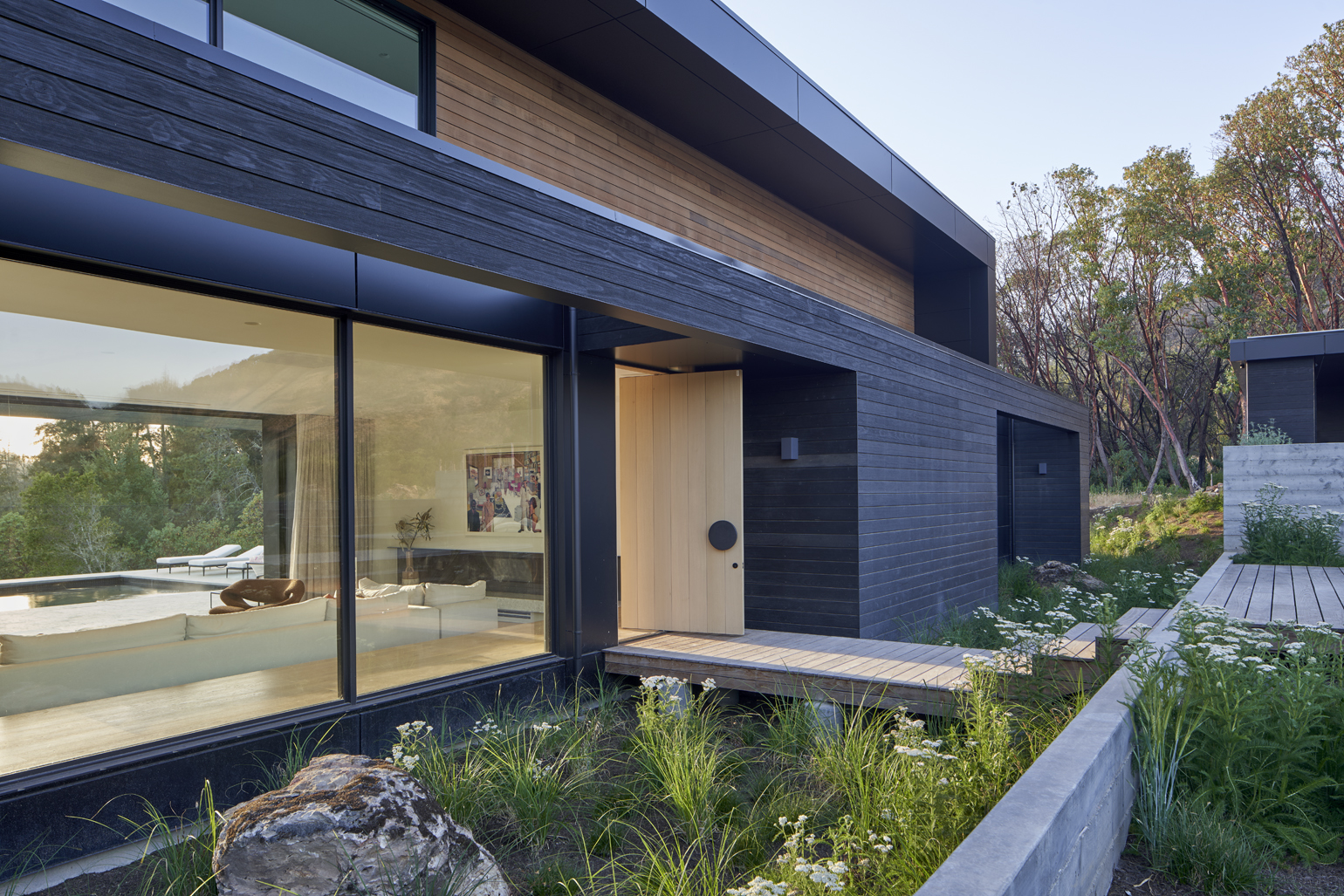
HSH: The fire danger in the wine country is very real, especially on the hillsides. One really good example of fire-proofing is a home called Downtempo. It’s 80% prefab and 20% site-built construction. The exterior is largely metal framing and shou sugi ban, which is a Japanese charred treatment that’s resistant to fire.
I noticed that not all the homes in the book are isolated, with tons of acreage. Can you talk about one of those houses?
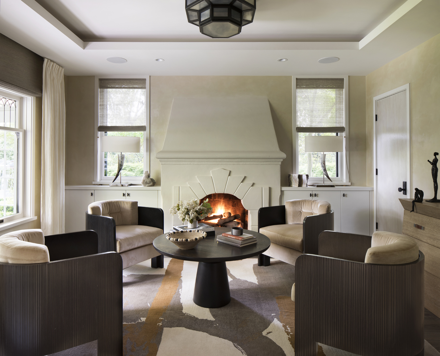
CRE: The family who own Hughes Family Vineyards lived on their winery property for years. They were tired of driving to town, and they’re very social, so they got the idea to live in downtown Sonoma. They bought a historic arts-and-crafts bungalow. It’s been beautifully updated. You go through the historic part, and then you enter into a contemporary part at the back. It’s spectacular. They have a beautiful outdoor space and an old barn. They’re just a few blocks from the main square in Sonoma.
Obviously, spending time outdoors is a huge part of wine country living. How do you see people crafting the outdoor experience these days?
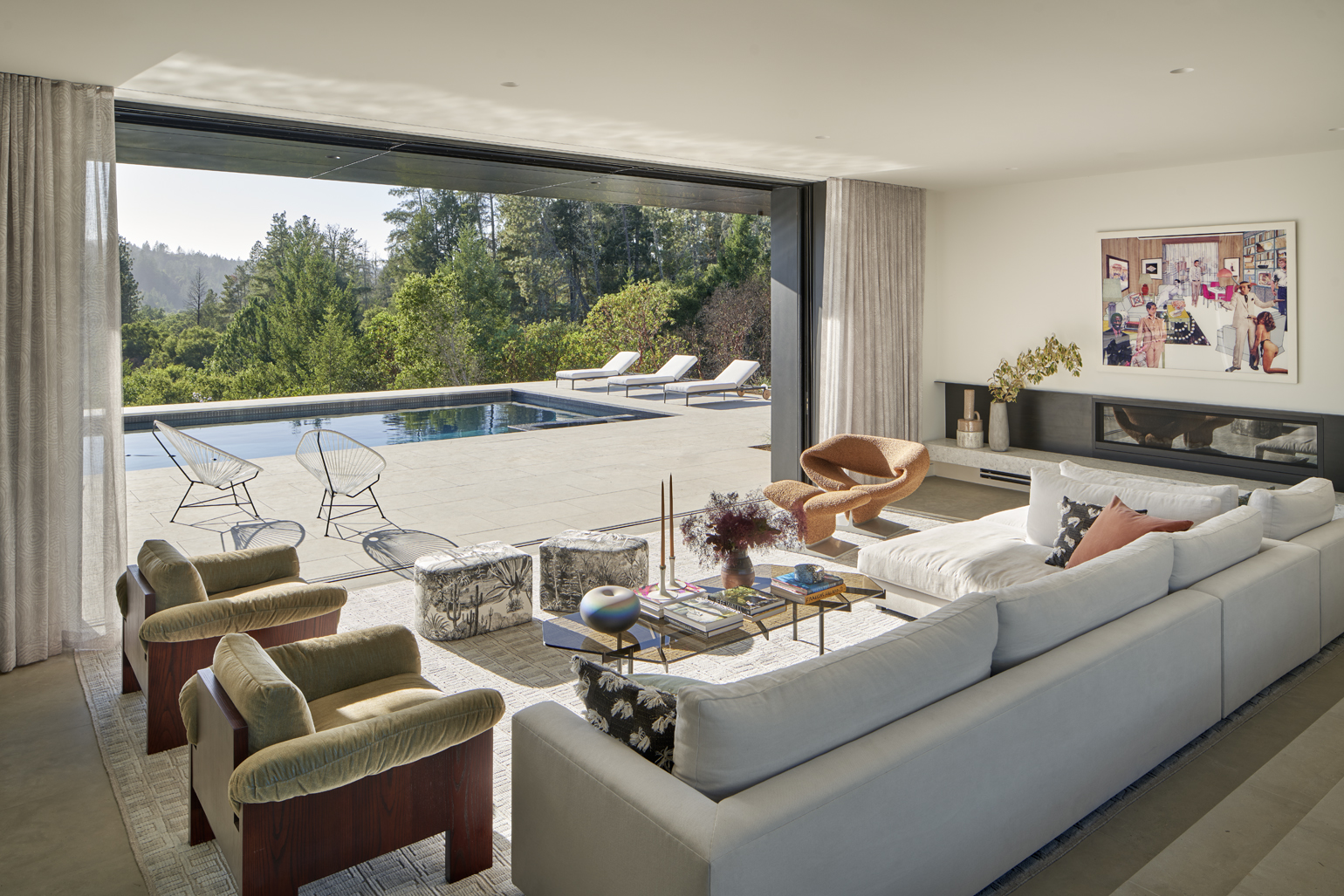
CRE: Most of the homes have what we call a “Nana door” — Nana is the brand of folding doors — i.e., an entire wall that opens up to the outside. There are year-round outdoor living rooms, with heaters and fire pits.
HSH: One huge thing I’ve noticed is a total integration of the disciplines: architecture, interior design and landscape architecture. In one home, the “Black Box House,” you come up to the front door, and you can see all the way through to the back of the house and the view. The architect frames it, the interior designer does what’s in-between, and then the landscape architect handles the outside. It all blends seamlessly.
CRE: And with the outdoor spaces, there are lots of vegetable gardens, which the homeowners are going to use. Everything is about drought tolerance, native species and blending into the surrounding landscape. These are disciplined interventions with a naturalistic approach.
How are people incorporating art into their home in wine country?
HSH: A lot of the artwork in wine country is outdoor sculptures, and some of the outdoor art isn’t even recognizable as art, per se. At one home, there’s a sculptural steel half-moon crafted by a local artist that holds back the hillside and forms a space for a fire pit.
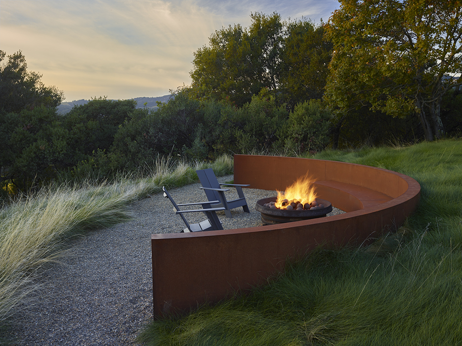
CRE: It’s a restrained approach, because the views are such a huge part of the experience.
This article originally appeared on spacesmag.com.
How to Help:
If you’re interested in helping more people have access to design services, you can support the nonprofit Designs for Dignity, which transforms nonprofit environments through pro bono design services and in-kind donations.
More from Better:
- Food For Thought Raises More Than $106,000 To Address Food Insecurity and Support Illness-Prone Individuals in Sonoma County
- Perfect Summer Wingmen: 8 Great Dishes to Bring to the Next Backyard BBQ
- Napa and Sonoma Are Open Again: The Top New Destinations for Tastings, Dining and Wellness

Liz Logan is the editor-in-chief of SPACES. Her writing about art, design and lifestyle, has appeared in numerous publications, including The New York Times, The Wall Street Journal, O, The Oprah Magazine and Martha Stewart Living. She is a passionate supporter of several youth arts programs across the country.
